
Regular readers know that English is not my mother language, but are kind enough to forgive me for my many mistakes.
I am always willing to learn. Today, while researching for an upcoming post, I came across an expression I never heard before: "spiffy charts". I felt in love with "spiffy charts" the moment I read it. And I read it straight from the horse's mouth (I mean Microsoft).
If you don't know how to make a chart and are keen to preserve that blissful ignorance, I highly recommend Microsoft Office Online Training, specially the module [Create a professional looking chart] (link no longer available) (regular readers also know how I love "professional-looking charts"). You'll learn how to "customize your charts to make them more attractive, memorable, and effective". This means useless charts.
So, let's see how to turn a humdrum (this is a new word, too...) chart into a spiffy one. First, to de-clutter your chart remove grid lines:
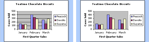
As you know, grid lines are useless, specially if you don't care about the data. I would remove the gray background and the border around the legend. And I'd give the chart a more descriptive title to tell the users what they are seeing, but that's my personal taste.
Then you should remove the y-axis and add labels to each column, further "decluttering" the chart. At this point the readers start sighing for a nicely designed chart table.
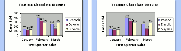
Want to give your chart a little more "flair" and make them more "professional-looking"? Just add a gradient fill and a subtle shadow:
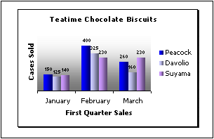
Now comes the spiffy part. Imagine that you have a 3D column chart with two series, and one obscures the other. What do you do? No, you can't remove the stupid 3D effect (remember: you want to make t spiffy chart, not a humdrum one). Well, all you have to do is to change the order of the series:
Much better now, don't you think? They accept that 3D charts "can be more attractive, but sometimes more difficult to read accurately" (surprise, surprise!). Apparently that's a detail in the grand scheme of things. You are excused from making accurate charts if you are making professional-looking ones.
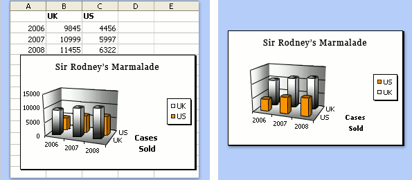
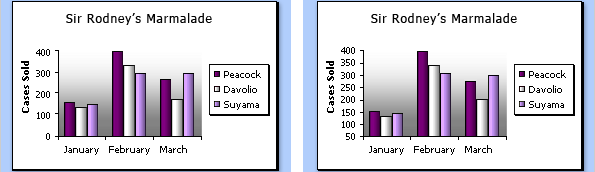
So, what else can you do to improve your chart? Ah, yes: the y-axis in a humdrum column chart always starts at zero. We don't want that, do we?
Now you know how to make inaccurate, professional-looking, spiffy-with-a-flair marmalade charts. Please go straight to the kitchen, make some real marmalade and forget all you've learned about data visualization in the Microsoft Office Online Training.
(This is not a real Microsoft Office Training site, is it? It must be some kind of spoof site, and I fell for that trick. Right? Right?)
Sigh...
