
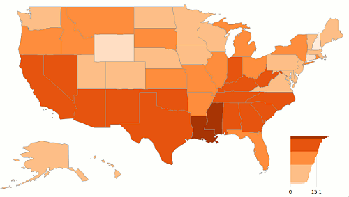
Choropleth maps are the pie charts of cartography. Both can show us a simple pattern, but that's a very low starting point. And both have severe perceptual issues. One of the issues with maps is how to define classes.
Gregor published last Friday an interesting post and I wanted to play with the same data, percentage of population living in poverty (and use my Excel map...). Let me show you some of the variations you get when selecting different class limits.
Same number of states
You assign the same (or approximate) number of data points to each class:

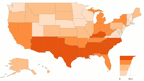
Equal intervals
Divide the range by the number of classes (pro tip: don't ever do it when you have on outlier at the top or at the bottom, like the District of Columbia for population density).
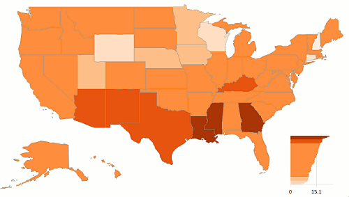
Positive / Negative
This one has a class limit exactly at the national average (four classes: two above and two below the average).
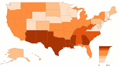
Here we define a large middle class to focus our attention on the extreme values:
Around national average
Now we are assuming that there aren't much differences in the data points around the national average:
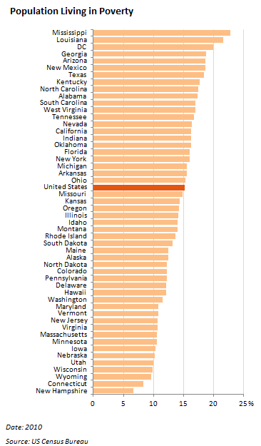
And here is the data displayed in a bar chart:
As you can see, for each definition of class limits you get a different message. Most people just use equal intervals, but that's lazy, IMHO. Using equal intervals in a choropleth map is like sorting a bar chart alphabetically. The only thing that is worse than equal intervals is equal intervals plus round numbers.
You cannot assume that the data is uniformly distributed, so most of the time you shouldn't use equal intervals. My personal preference is to create homogeneous classes, using the data itself to define their number and their upper and lower limits. You can do it using complex statistical analysis, or you can do it just by looking at a bar chart or a scatter plot.
The data will tell you which is the best sorting key or class limit. So, like everything else in data visualization, let the data talk first.
