
We know how popular pie charts are in business presentations, but pie charts and infographics is a marriage made in heaven. Let me share with you 16 cool ideas to add pie charts to your next infographic. I'll add a brief comment to tell you what makes each unique and link-worthy. Please note that these are simple drafts in Excel. Adding makeup is your job :)
1. The accidental nightingale
The first pie chart is for the data visualization crowd out there. They'll love it. Shrink and enlarge slices at will but don't change them based on actual data. You want to be free from that mundane realism.
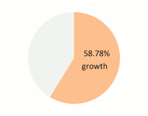
2. The sub-prime
Using a pie chart to display growth sends a very powerful message: "There is no negative growth. Enjoy life. Silly."
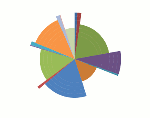
3. The Judas Cradle
You don't want to know what the Judas Cradle is, but this pie chart variation will do something similar to your audience's minds. How cool is that?
4. The pendulum
The reader will be moving his/her head from the legend to the pie and back. Nice physical exercise and great feedback: place the legend below the chart for Yes or on the right for No.
5. Inverted Gestalt
Gestalt psychologists say that "the whole is greater than the sum of its parts". Now put the sentence upside down for a fresh perspective: "the sum of its parts is greater than the whole" . Use slices that total more than 100% and you'll get lots of links from the whole data visualization community. This is subtle, please use it carefully.
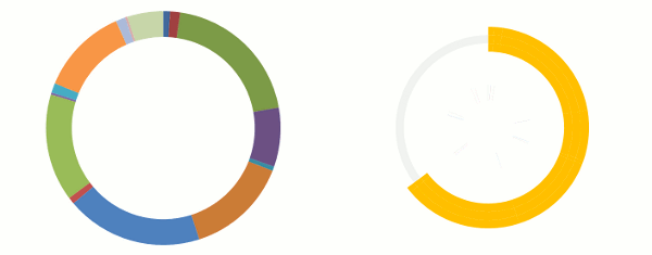
6. Gestalt Plus
This is pure gestalt. Show the total itself and you can be sure that the whole indeed is greater than the sum of its parts.
7. Alpha-Beta
Sort the slices in a pie chart alphabetically and your audience will stay longer, trying to figure out the largest slice, and the next one, and the next one... Endless fun.
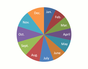
8. History repeats itself
Everyone knows that history repeats itself as a farce. Since time is circular, pie charts are the perfect tool to display time series. Do it properly and the reader will start spinning around too. Try it!
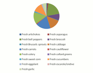
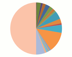
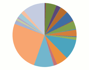
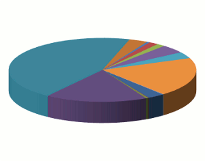
9. So much to say
If there is much to be said, just say it. Add every single slice you can find (check under your bed too). You have a clever audience, they know what is relevant and what is not. Right?
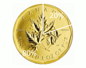
10. Keep it simple
If your audience can process simple messages only, or you've left too much empty space to fill, a pie chart with two slices is a good starting point. If the reader needs more, use the chart above.
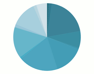
11. In the shades
This is so mesmerizing that your audience can't even click the back button. They'll keep counting how many shades there are and trying to correctly connect them to the legend.
12. The Rack
Leave my site and this is what I'll do to you. Scary!
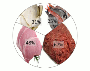
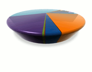
13. The real thing
Nowadays you can make a pie chart look so real that the readers will want one in their living rooms.
14. Retro chick
Oldie, but goodie.
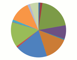
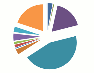
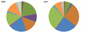
15. Best friends
This is also an effective way to make your visitors stay longer on your web page, trying to figure out the differences between slices and between pies. Use several pie charts for extra points.
16. Bending the bars
This is what you get when you cross a pie and a bar chart. Simple, elegant, no boring axis and very link-worthy.

Now, seriously, let me put it this way: you can use this post as a source of inspiration for your linkbait infographic or you can read it as 16 things you should never do (or accept) when communicating with data. Which one will you choose? Tell us in the comments.
If you've enjoyed this post please consider sharing it using the Share button below. Thanks!
