
Are you sure you can recognize an Excel chart from miles away? I thought that too. Then I started playing with some data visualization historical milestones and now I'm not so sure. Trying to recreate these charts in Excel is a great way to improve your Excel skills and pay a humble tribute to the data visualization founding fathers (their charts always look better).
The challenge is to recreate the original chart without cheating: a single chart (no overlapping charts), no shapes/clipart to display data and, obviously, no Photoshop. Here is my rendition of Playfair's prices of wheat and weekly wages:
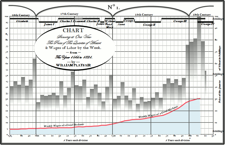
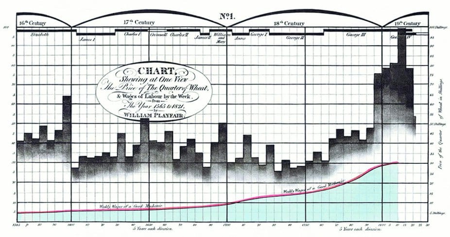
There are some details that I would like to improve (fonts, custom number formats) but it came out closer than I expected. Excel doesn't like areas in front of columns, and that was the major challenge. If you want to compare to the original, here it is:
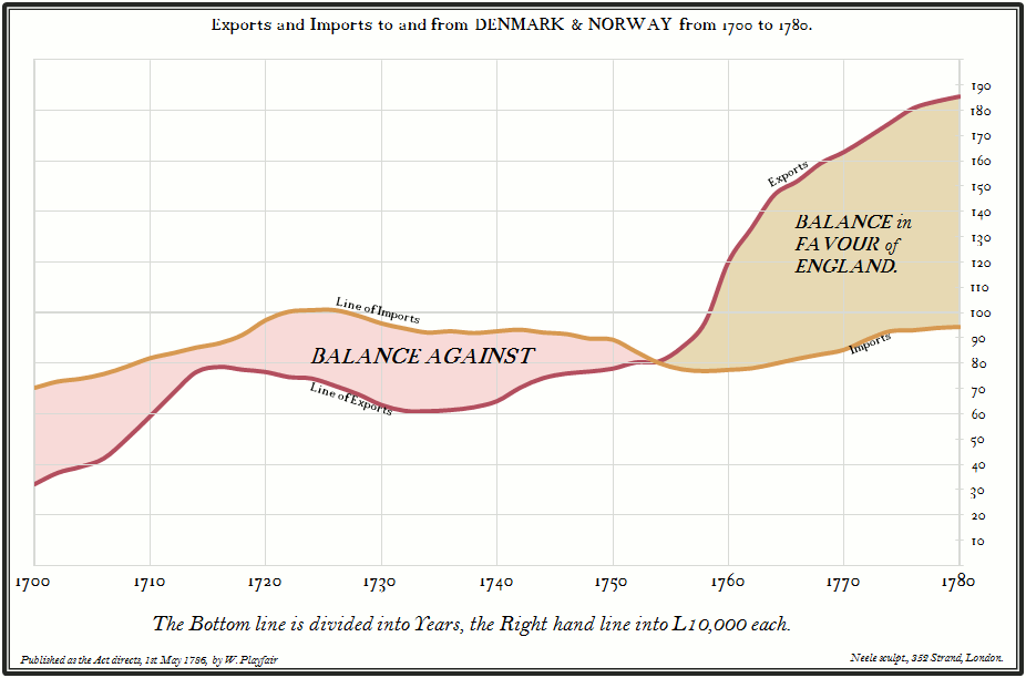
Playfair's wheat prices chart was my second chart. I started with a simpler one, England exports:
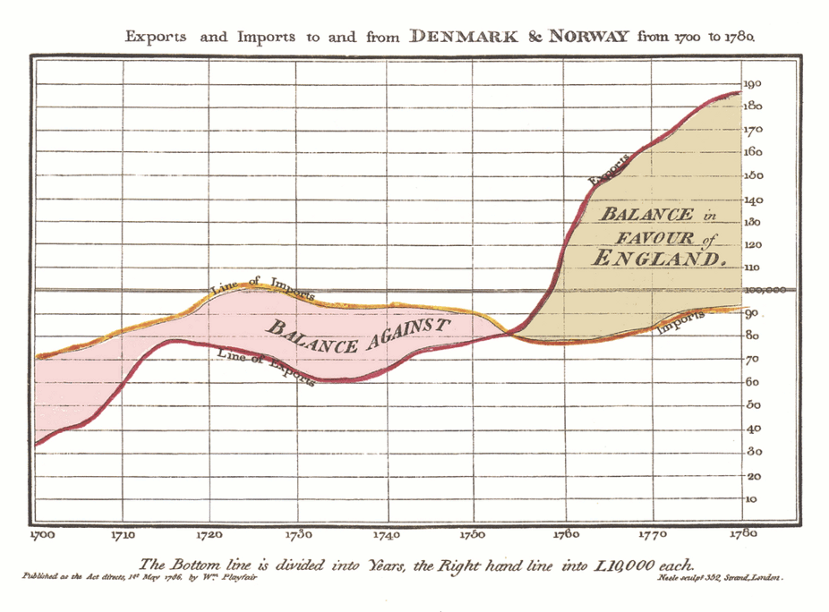
And here is the original:
I'm not sure if I'm ready for Minard's map of Napoleon's March but I'll try.
And the takeaway is: don't make your Excel charts look like Excel charts (and don't make your Excel dashboards look like Excel dashboards...). You have a fair amount of latitude to come up with a chart that reflects you, your style, your sense of beauty, your sense of how this data should be presented. Yes, it's plain old Excel, but they don't now it, do they?
Your comments?
