
ℹ️
This article was originally published on my ExcelCharts.com blog in 2015 and migrated to this site in 2026. The text preserves the context of the original publication.
Microsoft is apparently waking up and getting a bit more serious regarding visualization in Excel. Excel 2016 gets a few more chart types but, except for treemaps, nothing really new. We could make them with a little of work, but it's nice to have them ready to use.
Here are the new chart types in Excel 2016:
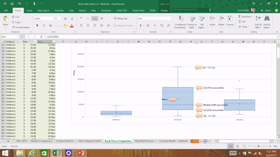
Boxplots (box-and-wiskers)
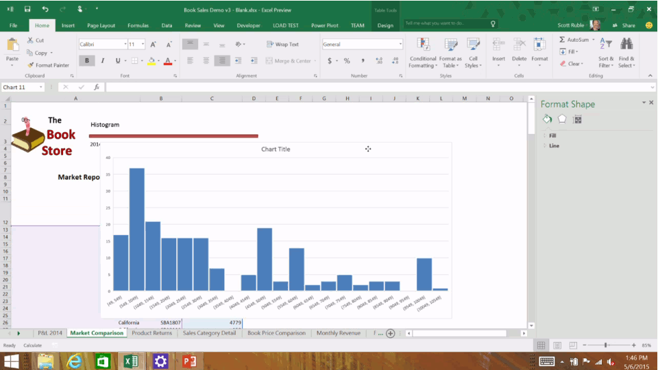
Histogram
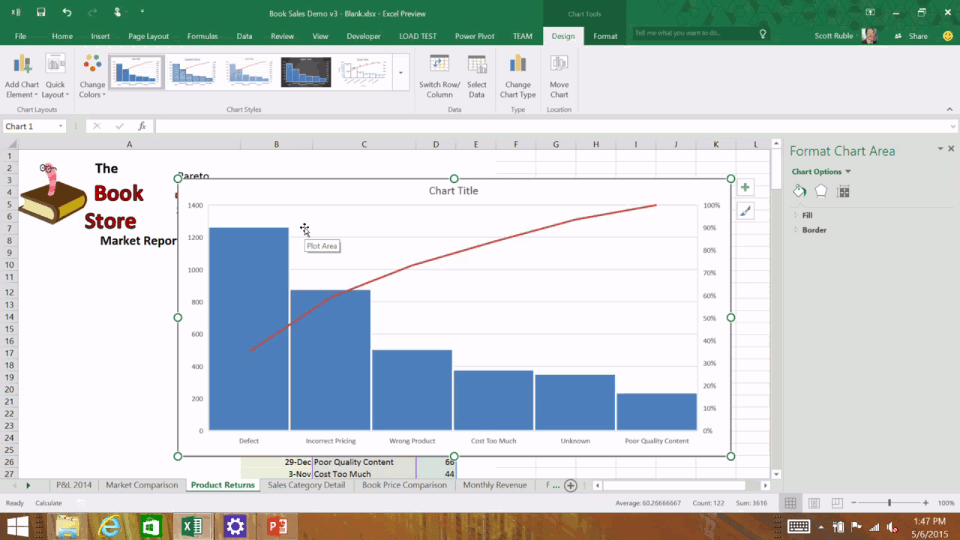
Pareto
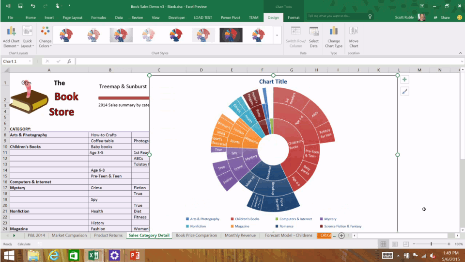
Sunburst (I prefer to call them multi-level pies)
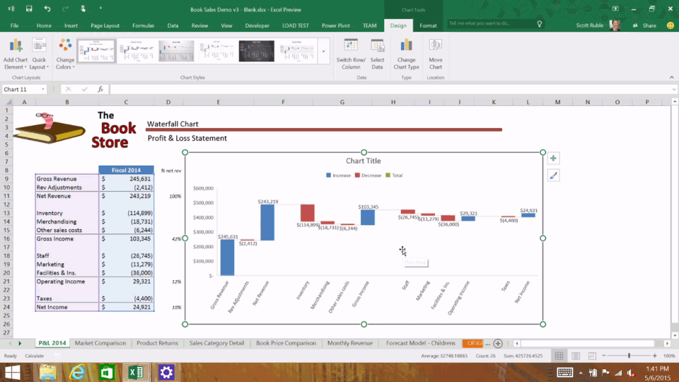
Waterfall
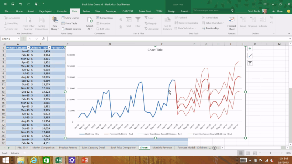
Forecasts
So, what's the missing elephant? For me, the elephant is the ability to turn every single chart into small multiples. I would trade all those charts above for that functionality, any day.
What's your missing elephant?
