
Here is the draft result of my little weekend project, making horizon graphs in Excel:
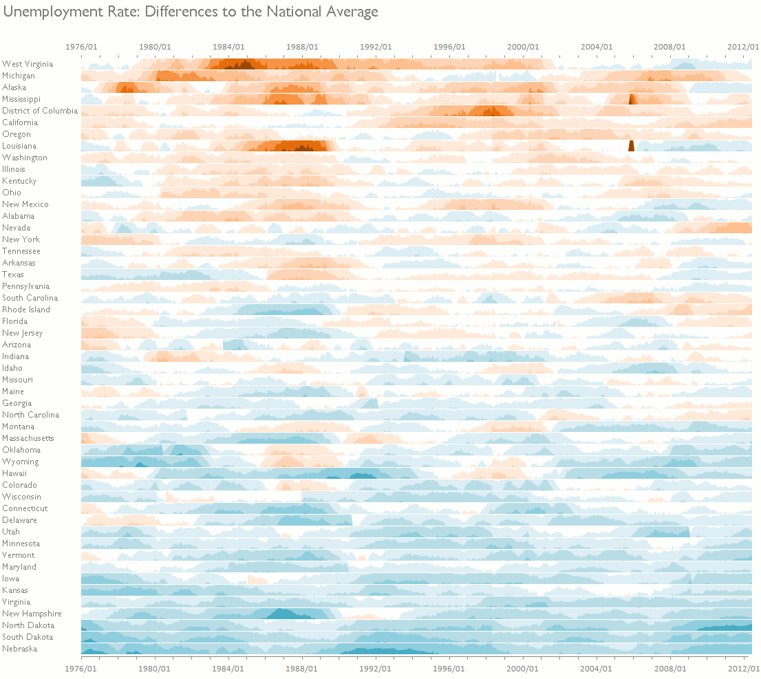
I'm probably using too many color bands, but I like it! The horizon graph is a very compact way to display lots of data points and a shiny example of how to break the rules for a good cause. It was developed by Hannes Reijner at Panopticon and Stephen Few discussed it in his newsletter and in a blog post. You can learn more about the horizon chart here and here.
Horizon graphs are even better if you use them as small multiples, as I did in the example above, and in the one below, from Panopticon:
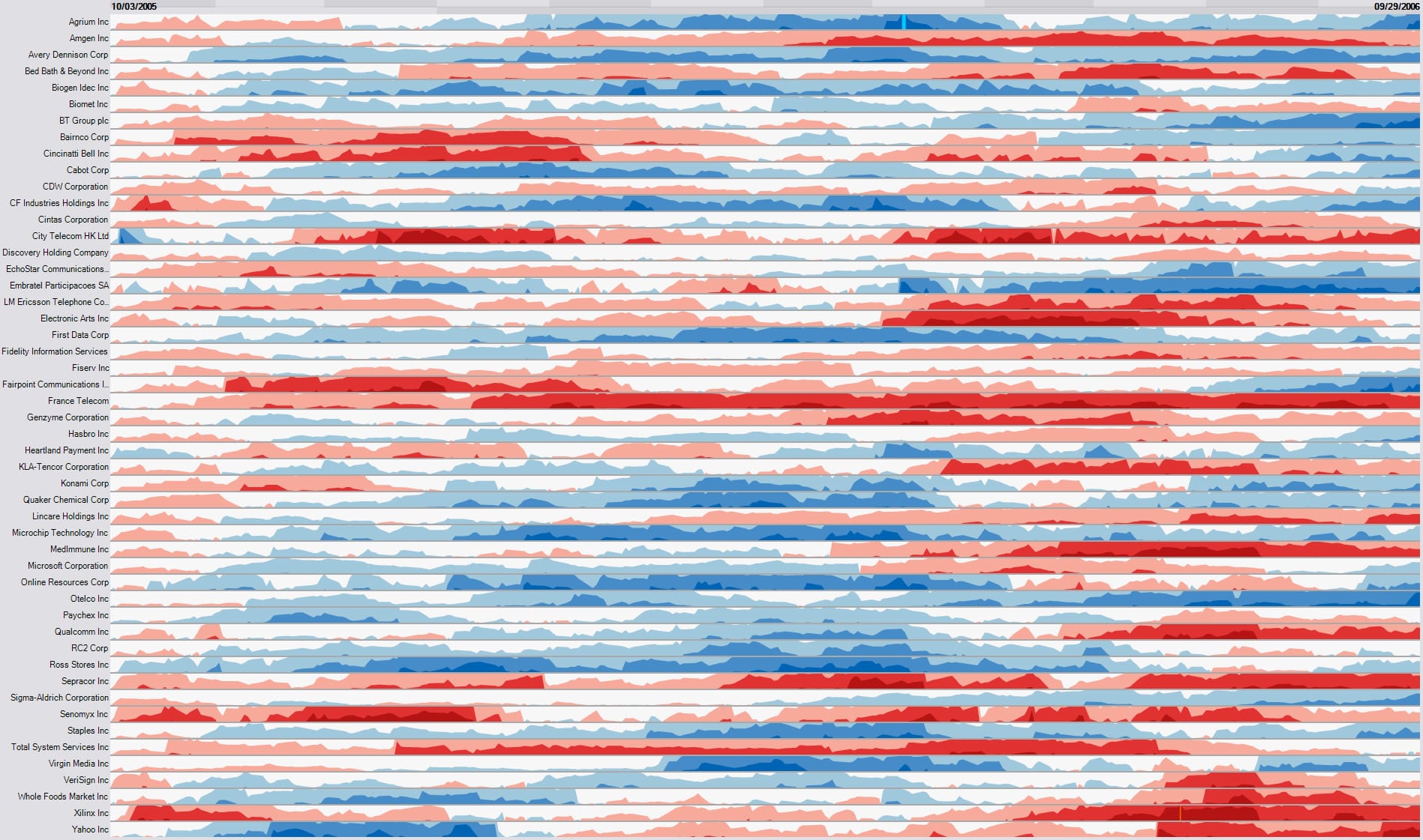
There is something I don't like about this one. If you look closely (click to enlarge), you'll see that the charts are sorted alphabetically. This is a capital sin in data visualization. Much of the power of small multiples is lost when you do it, so don't. You should think of a small multiples display as a reorderable matrix, sorting the categorical axis to identify meaningful groups. I'm sure Panopticon's implementation allows you to at least perform a manual sort.
The Excel implementation
There isn't much to say about it. A macro copies the data for each state to a new sheet and splits it into 12 series, one for each color band. Then it creates the charts and stack them together. You can record the macro and add a for/next loop.
