
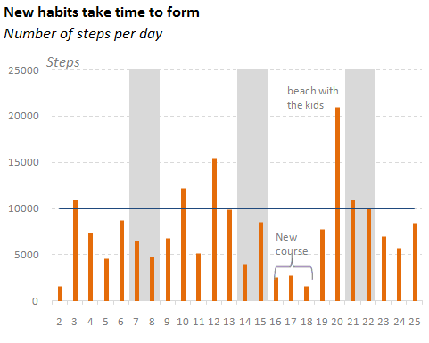
I recently bought a pedometer to make sure I walk at least those recommended 10,000 steps a day. As you can see, there is a strong variation, and no meaningful pattern is emerging. Now that I’m blogging about it, I’m sure that will happen soon :).
It’s commonly accepted that, when displaying a time series, you should use line charts to show trends, and column charts if you want the reader to compare individual data points. It seems that you can choose any one of them, but often you can't.
In a data set like the one above, there is too much variation, and a line chart is useless. Make a column chart instead, and try to explain the outliers.
So, use your common sense and don’t use a line chart when monitoring a new habit. Compare data points and if you can’t find a good explanatory variable just annotate the outliers and try to replicate the good ones.
If you want to give yourself a motivational boost keep repeating “I want to use line charts, I want to use line charts”. It will help you reduce variation and soon you’ll achieve your goals! (Scatter plots are even more powerful motivators, but don’t rush.)
