
ℹ️
This article was originally published on my ExcelCharts.com blog in 2013 and migrated to this site in 2026. The text preserves the context of the original publication.
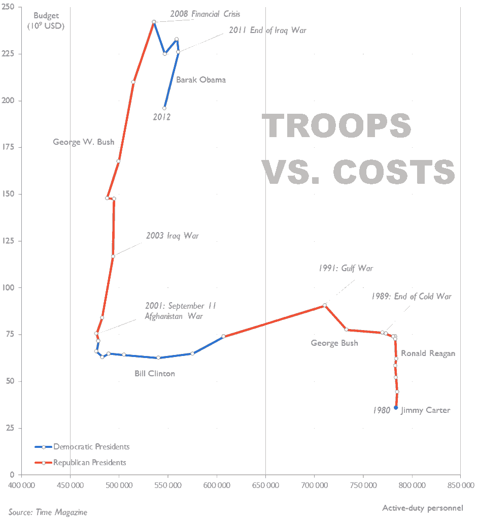
Time Magazine published a very boring combo dual-axes chart with a broken scale. Most of the time these charts beg for a connected scatterplot, so I made the one above. The original chart was something like this: I'm sorry, Time mag, but my chart tells hands down a much more interesting story. [UPDATE] Made a new, annotated version.
