
It's very simple, really: you do not compare proportions in a pie chart. Because a pie chart is not a comparison chart, it's a part-to-whole chart. When you do this:
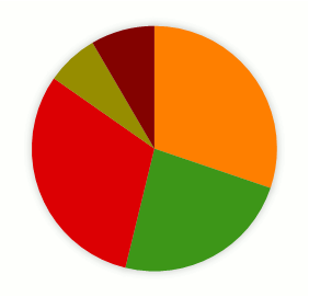
what you really want to do is to compare each slice to the whole, like this:

because, if you want to compare them you must do this:

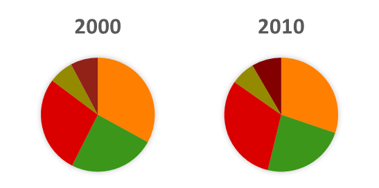
I hope that you find this pretty obvious. If you don't, let's add one more series.
When you do this:
what you really want is to compare categories for each year, so you use a bar chart:

or, even better, a slope chart:
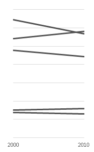
You never ever compare proportions, only a single proportion to the whole. The moment you change your question and want to compare data points you have to use a different chart. That's why the optimal number of categories in a pie chart is one.
Capisci?
