
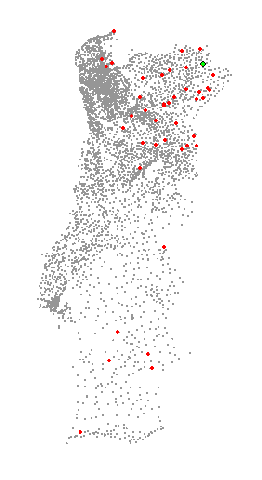
This is an Excel scatterplot. Each point is one of the 4200 Portuguese civil parishes. The green point shows the active parish and the red ones some parishes that may have a similar profile. Of course, if you select a different parish the red set also changes.
I like this idea of displaying geographic coordinates in a scatter plot and by that be able to see some (very basic) geographic patterns. Just by plotting the coordinates you get an idea of how the territory is structured and you can start asking questions ("why is the north so different from the south?"). By providing some more data (color coding the data points) we can add complexity to our questions.
If you think there may be a spatial pattern in your data and you (or the users) can't have access to GIS software, or you just don't want to learn another application, this technique could come in handy.
