
ℹ️
This article was originally published on my ExcelCharts.com blog in 2011 and migrated to this site in 2026. The text preserves the context of the original publication.
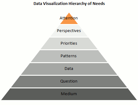
Is it possible to create a “data visualization hierarchy of needs” like Maslow’s hierarchy of human needs? I've tried that in the pyramid above. Here are the details:
- Is it the right Medium? A chart can really help processing data and minimize information overload, but what about “chart overload”? Don’t make a chart if you don’t need one, and make sure that a chart is the best vehicle for your message.
- Answer a Question: Let’s assume that you do need a chart. A chart is (should be…) a visual answer to a very specific question. What is the question? Try to use is as the chart title: does the chart still make sense? Make sure you chose the right data to answer the question.
- Present the Data accurately: A chart is a visual translation of an underlying data table. This translation shouldn’t distort proportions and relationships between data points.
- Emphasize the Patterns: The whole point of presenting the data visually is to take advantage of our built-in pattern detectors, but you must help them. Choose the right chart type. Don’t display the data randomly. For example, don’t sort a categorical variable alphabetically (that’s almost random). The sorting key should be the data itself.
- Establish Priorities: Create layers of reading. Grid lines are less important than the data, so they should be grayed out. Some series are leading actors, other series provide context.
- Multiply Perspectives: Add detail, create multiple views of the same dataset, add interaction.
- Grab Attention: Add color, make your chart aesthetically pleasing.
What do you think? Am I missing something? What would you change? Add your comments below.
