
Annotating your chart helps your audience to understand the reasons behind some patterns or outliers. But, please, please, don't bury the data under boxes and arrows and busy grid lines, like the one above does (from WTRG Economics).
How can you improve a chart like this? First of all, the series must be visible... :) Don't create a competition for the readers' attention. Notes should be in the background, like the axis, labels and other chart objects.
A note is not a marker. Add a note to explain a specific behaviour ("this happened because..."). If you have a time series, create a timeline outside the chart and add markers for relevant contextual events (there are several other design options).
It is easy to come up with something cleaner:
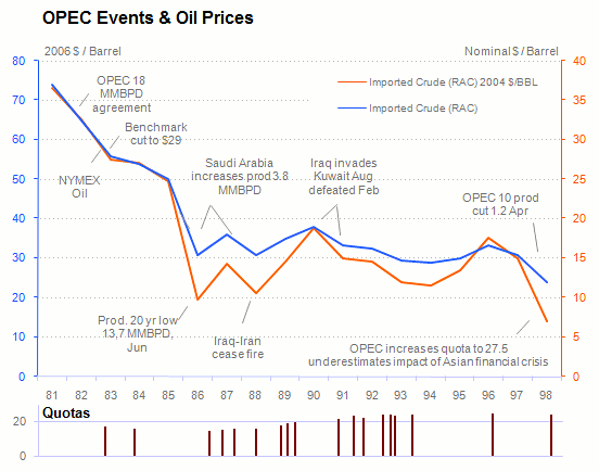
There was enough notes about quotas to create a new chart, with new insights. All the other notes are there, but they only murmur. I don't feel confortable with using two axis, but that's a topic for another post.
By the way: there is (at least) a perceptual error in my chart. Can you find it?
