
OK, maybe "love" is too strong a word. Let's say that 3D column/bar charts are like a tall and ugly building: better appreciated from the top, where you can't see it but you can enjoy a great view. Like this:
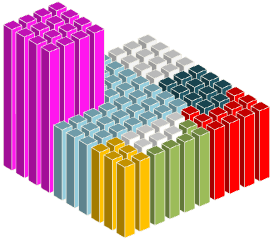
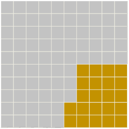
Now, change the viewing angle, remove gaps and you get this:

I'm shamelessly copying the first image in Robert Kosara's Square Pie Charts (I don't know how Robert made his). Check his post. He makes some square pie charts like this:
I'm still using the 3D column charts, with a 3D rotation of 0º (Y), 90º (Y) and 0º (perspective). We can have some fun and use circles instead of squares:

Or fill the columns with pictures:

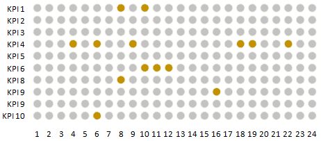
Or we can make a panel to display alerts:
No, I really can't fall in love with 3D column charts, but seen from above they don't look that bad, do they? And now you know how to make a square in Excel...
[Upadate: Forgot to mention that Juice Analytics discusses other ways to make square pie charts here and has a screencast here.]
