
The other day I was reading Dundas' whitepaper "Best Practices for Building Digital Dashboards" (PDF) [update: this whitepaper is no longer available] and you know what? What they say makes a lot of sense. I agree with at least 75% of what is written. For example:
... developers must be careful that the visuals do not interfere with the usability and efficiency of the digital dashboard...
or
Context is an item which in most dashboards is completely forgotten. This is baffling, as without context, KPIs are completely useless.
This really took me off guard. I was prepared for the worst and and what I get is this six-page whitepaper full of good advices that even Tufte would follow.
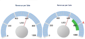
But wait... My skeptical mind wants to know if they practice what they preach. So, for example, what kind of context could we provide in a typical Dundas dashboard?
Here it is: add a little green stripe to a gauge, call it "context" et voilà: best practices at their best. Take a look at the report for similar insightful concepts "regarding usability and efficiency of the digital dashboard".
Corollary: if you follow best practices and use common sense, you'll be lost soon.
