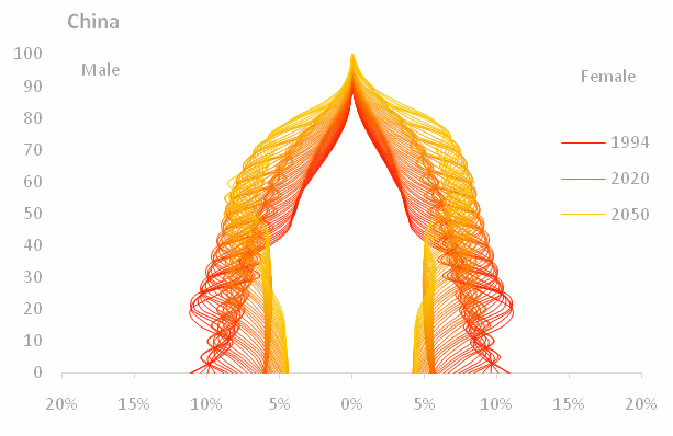
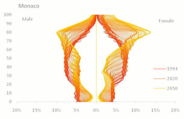
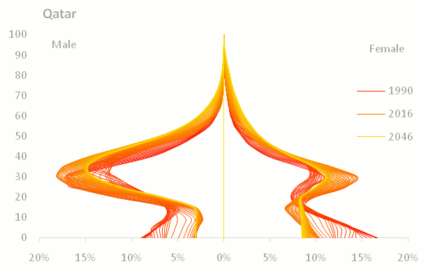
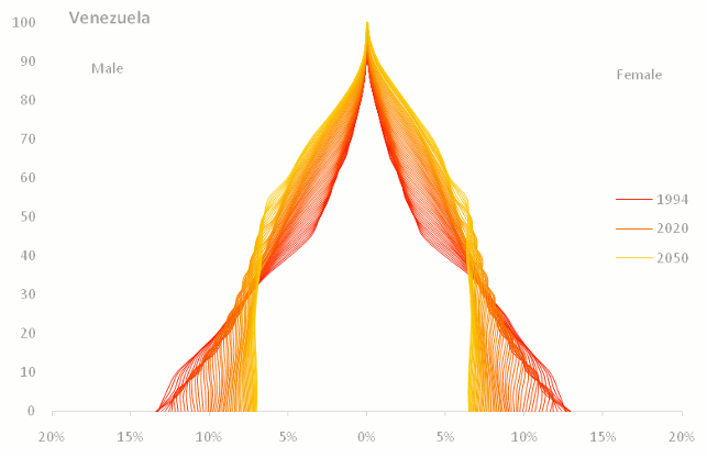
These are the population pyramids (and half-pyramids...) of some more or less randomly selected countries. Each series displays population by age group (both sexes) in a given year, from 1981 (darker color) to 2050 (lighter color). The charts share the same scales (5-year age groups from 0 to 100+ in the y axis, and 0% - 20% in the x axis) so you can compare them. Data (actual and projections) from the US Census Bureau.
Here are some examples for total population:


A few more:


Well, if the financial crisis doesn't break us, the relentless aging of the World population will. Aesthetically pleasing tragedies. In Excel.
If you'd like to see other countries just let me know in the comments and I'll add it.
UPDATE: Here is an example of the same data by sex and properly labeled: