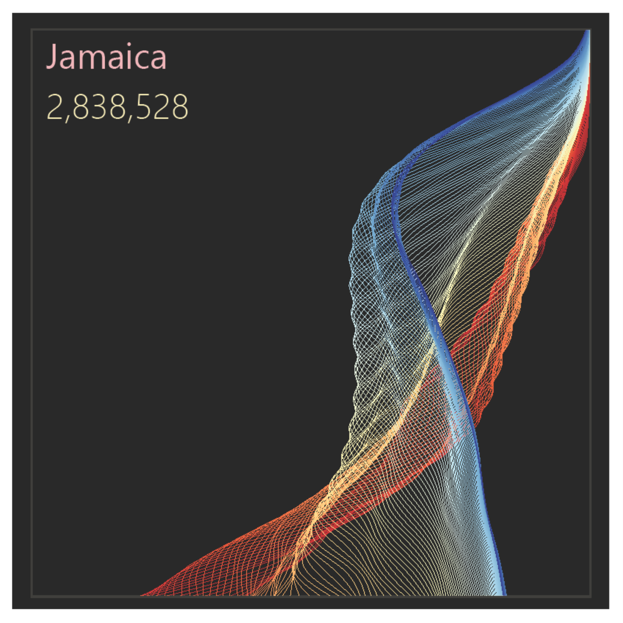
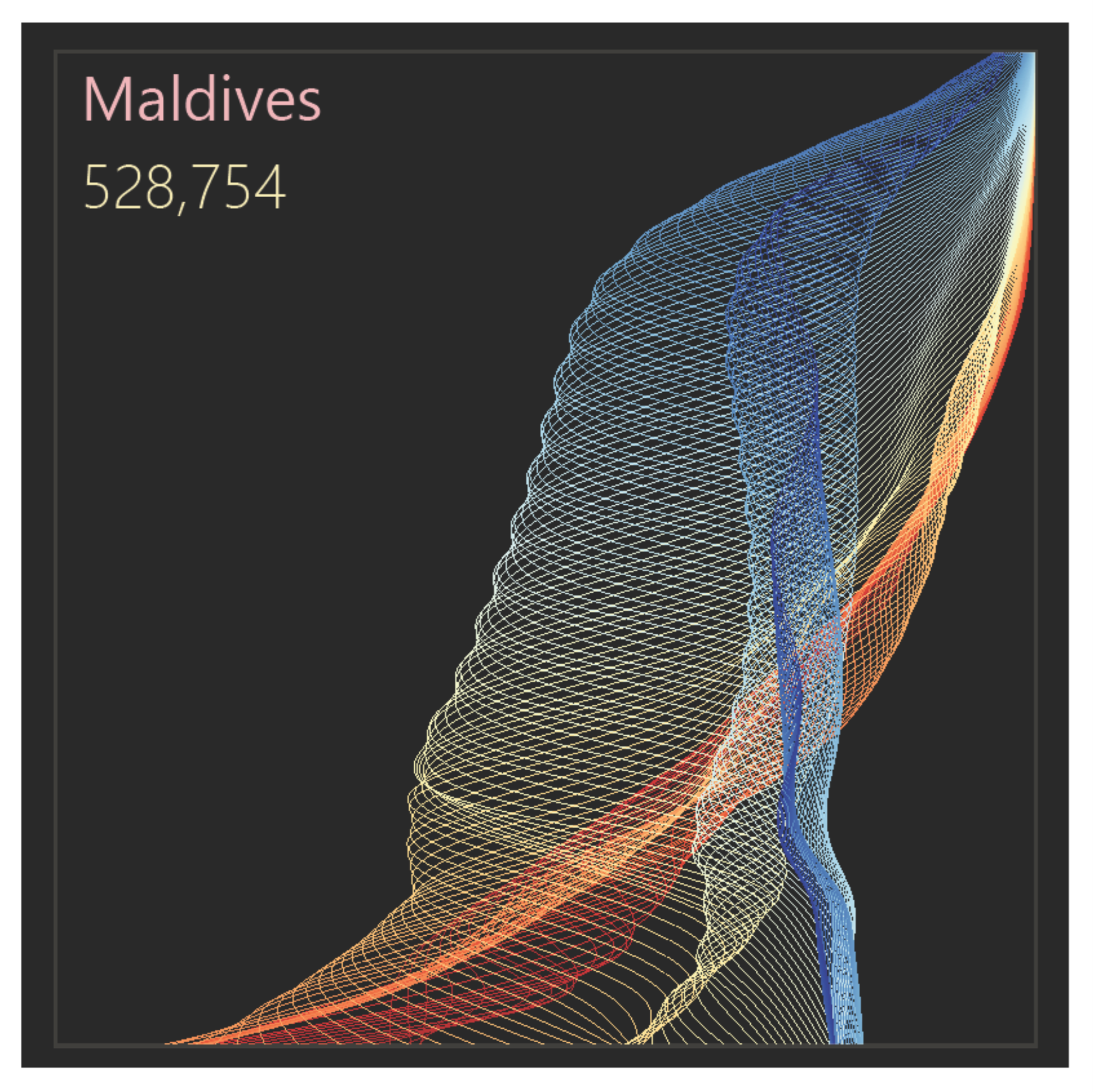
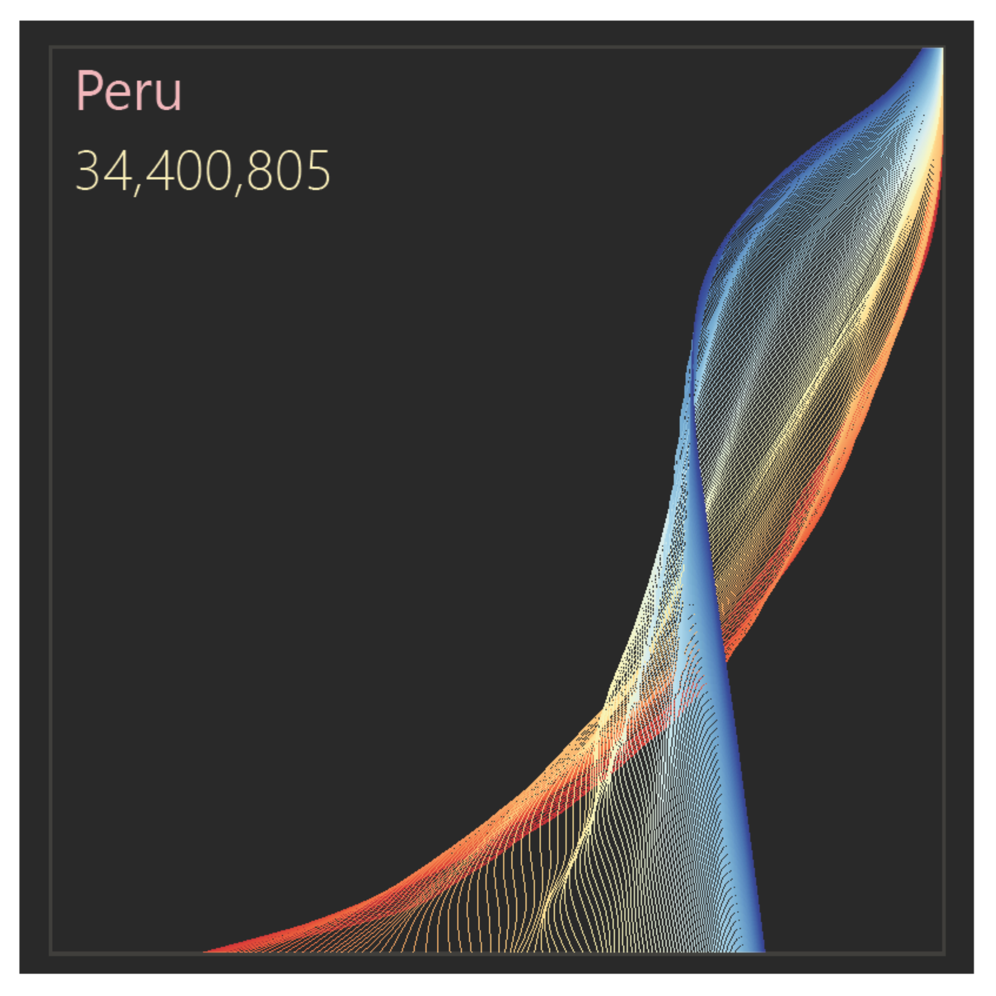
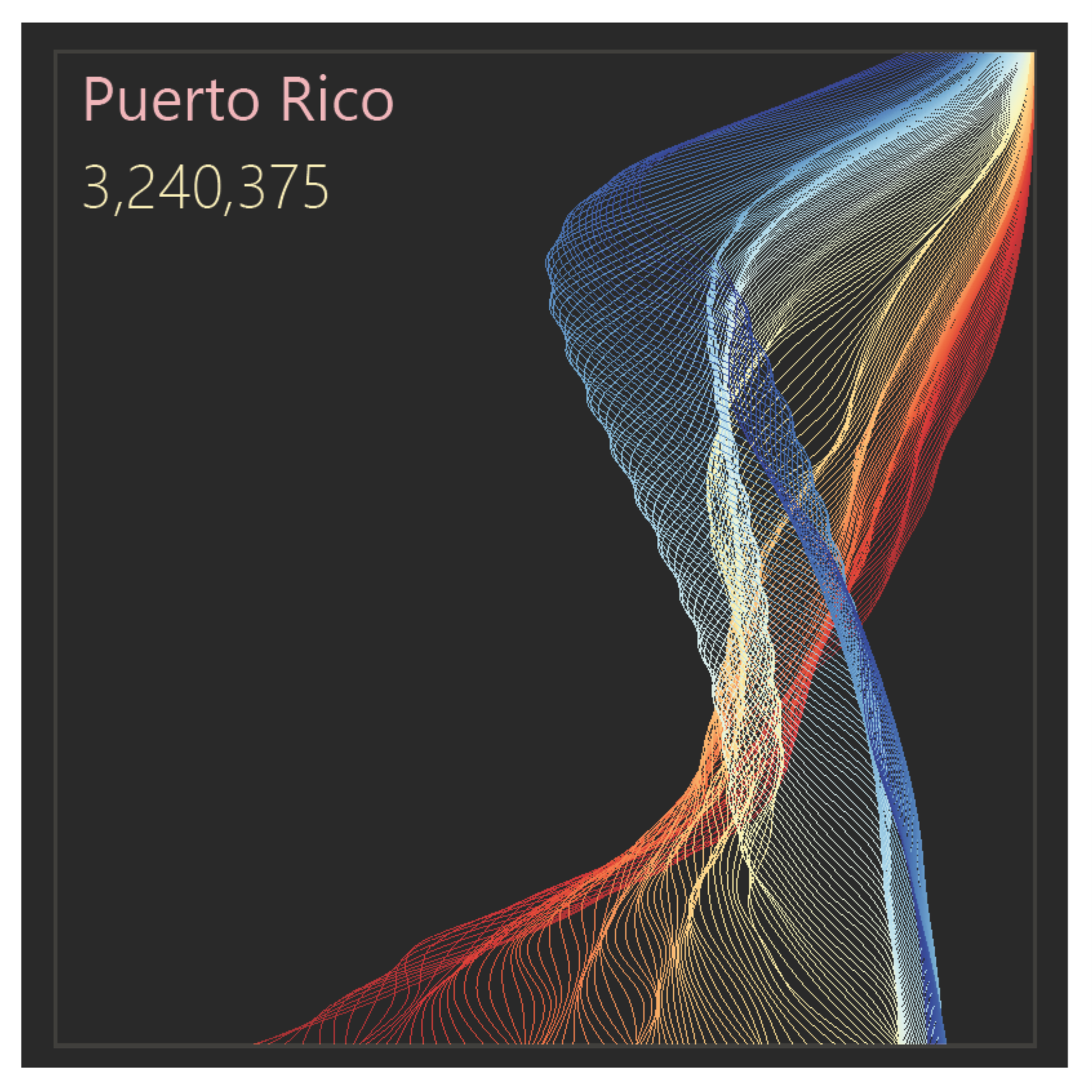
These interactive population pyramids show the population structure by age in five-year groups for almost all countries, and its evolution between 1950 and 2100 (estimates between 1950 and 2023 and projections between 2024 and 2100). You can select the country and define a time range to display population structure change using a fixed scale on the x-axis. The data come from the United Nations, and the 2024–2100 projections correspond to the medium variant (standard UN terminology).
Open version
In this version, closer to the traditional pyramid, men are shown on the left and women on the right. It also includes automatic animation.
Folded version
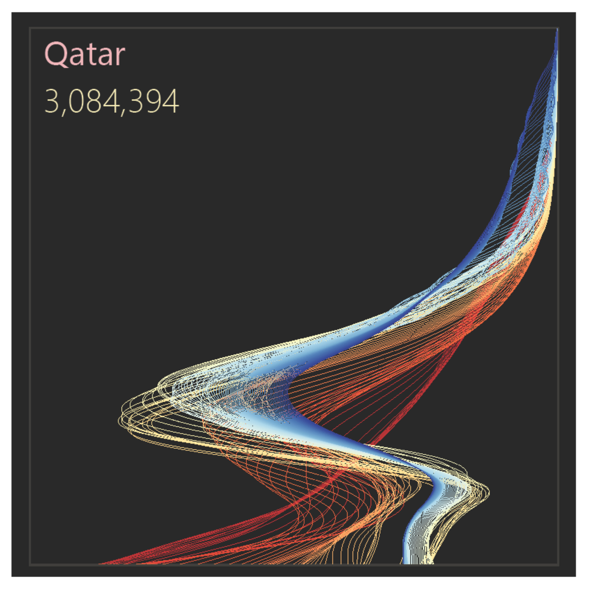
This version allows you to select a) the total population; b) males only; c) females only. As commented below, in most countries the population is sufficiently symmetric for a split by sex to have little analytical value (there are exceptions, such as the Gulf states, like Qatar). It does not include automatic animation, but the same effect can be achieved by moving the controls below.
The origin of the design
I published the first version of these population pyramids a few years ago. Occasionally, I like to revisit them, update the data, experiment with new color palettes, and test their implementation using other tools.
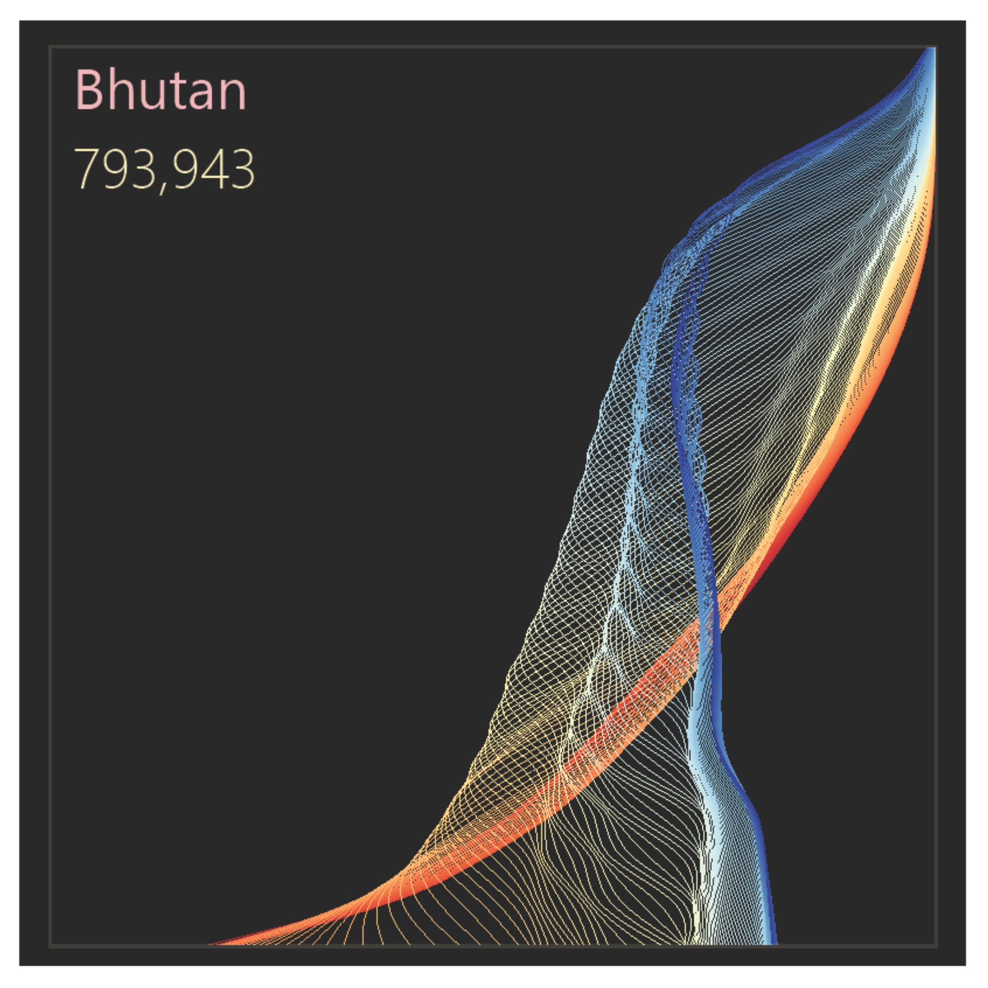
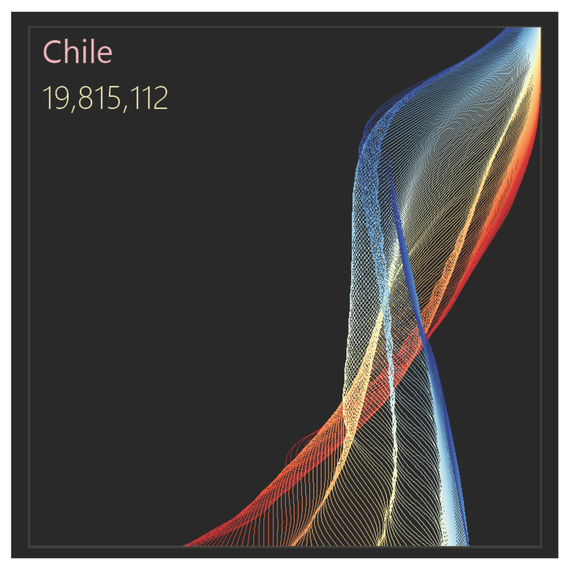
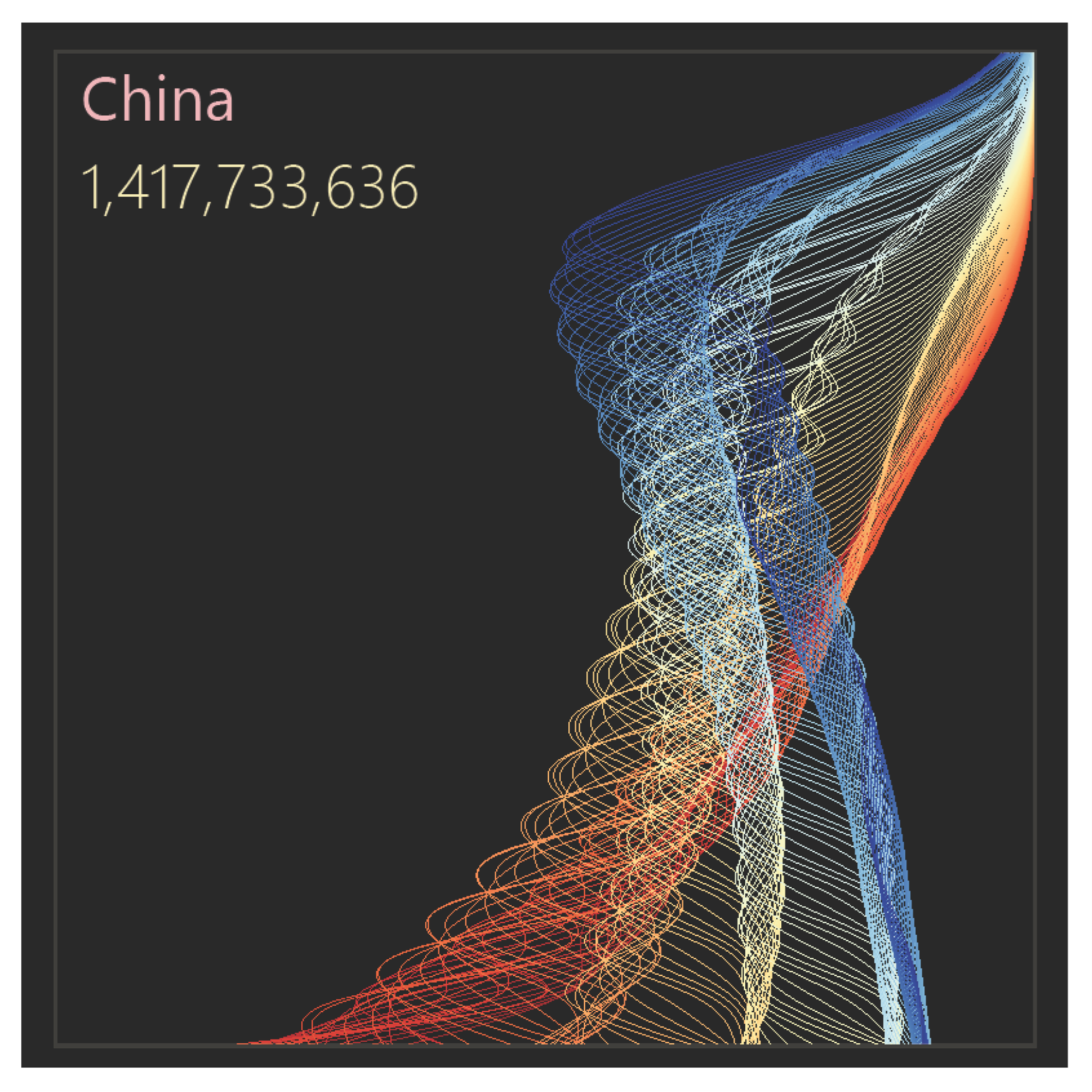
This new version was built in Vega and is the first interactive version I have published. I also chose a diverging color scheme to make changes in population structure between 1950 and 2100 easier to observe in most countries.
Although the first version of these population pyramids is old, what led me to it was a process that has not changed much over the years: a question that reveals an inefficiency in the way that question is traditionally answered.
In this case, it was something like “What if I wanted a more effective way to compare sexes?” and also “What if I wanted to compare population over time?”
The solution to both was the replacement of traditional bars with lines and placing all the data being compared on the same side of the axis.
Another thing I also like to do is to stress-test a design: can it handle a volume of data that, in theory, will not be used? In this case, I had recently discovered the United Nations demographic estimates and projections, covering a total of 150 years. I decided to go all in and use all the data. It was clear to me that I could only use color to encode the years. This meant creating a 150-step color gradient and making it clear to the user where, color-wise, the time series began and ended.
The use of color, combined with interpolation to smooth the connection between points, created something I had not anticipated: lines that resemble a diaphanous fabric gently stirred by the breeze (sorry, that is how I see these charts).
Not being particularly sensitive to color harmony or to more sophisticated choices and uses of color, I feel these charts have an aesthetic potential that my color choices did not fully exploit.
The traditional design of population pyramids
The population pyramid is probably the most recognizable and popular chart associated with a specific field of knowledge. Most of us can read it with relative ease. What is less familiar is the encoding of certain profiles: a pyramidal shape or an urn-shaped profile have different interpretations, and generally correspond to what demographers call the demographic transition.
How did the chart originate? Someone, in the 19th century, noticed that in a typical population the number of men and women is similar, and that at the time the number of people by age tended to decrease, with many young people and few elderly. From this observation, it is tempting to create a chart resembling a pyramid:
- Placing population on the horizontal axis and ages on the vertical axis creates the third side of the triangle.
- Separating the sexes, by rotating male values to the left, creates symmetry.
The problem with the traditional design
The original population pyramid design choices are inefficient. This is a common problem when we have a preconceived idea of a visualization and try to force the data into that display. We see the same issue when we try to adapt organizational data to the imagery of car dashboards.
What explains this loss of effectiveness? Here are a few reasons (see the note below):
- When we have ordered categories, such as ages, they should be placed on the horizontal axis, with quantitative data along the vertical axis. Using the vertical axis for categories is more commonly associated with rankings.
- The left side of the horizontal axis corresponds to negative values. The pyramid forces us to think in absolute values (in most applications, male values must be multiplied by -1 and the negative sign then removed from the axis labels).
- The split by sex in the chart makes interpretation harder. Since values are generally similar, small differences can be meaningful, but they are not perceived because male and female values are far apart.
- The very segmentation between men and women is often irrelevant for interpreting the population profile (but there are exceptions: in the interactive chart above, select Qatar and observe the difference between men and women).
Legacy constraints
Despite their issues, traditional population pyramids have historical weight and strong recognition, which makes it difficult to adjust the design towards more efficient and effective displays. I think this is an example where effectiveness at all costs has a more negative than positive impact. In the data visualization courses we see several examples of this, particularly when discussing Edward Tufte.
What seems reasonable to change, therefore, is what I did here: keep the data on only one side of the axis, and replace bars with lines. Rotating the axes, with ages along the horizontal axis, creates, in my view, excessive disruption with no meaningful benefit.
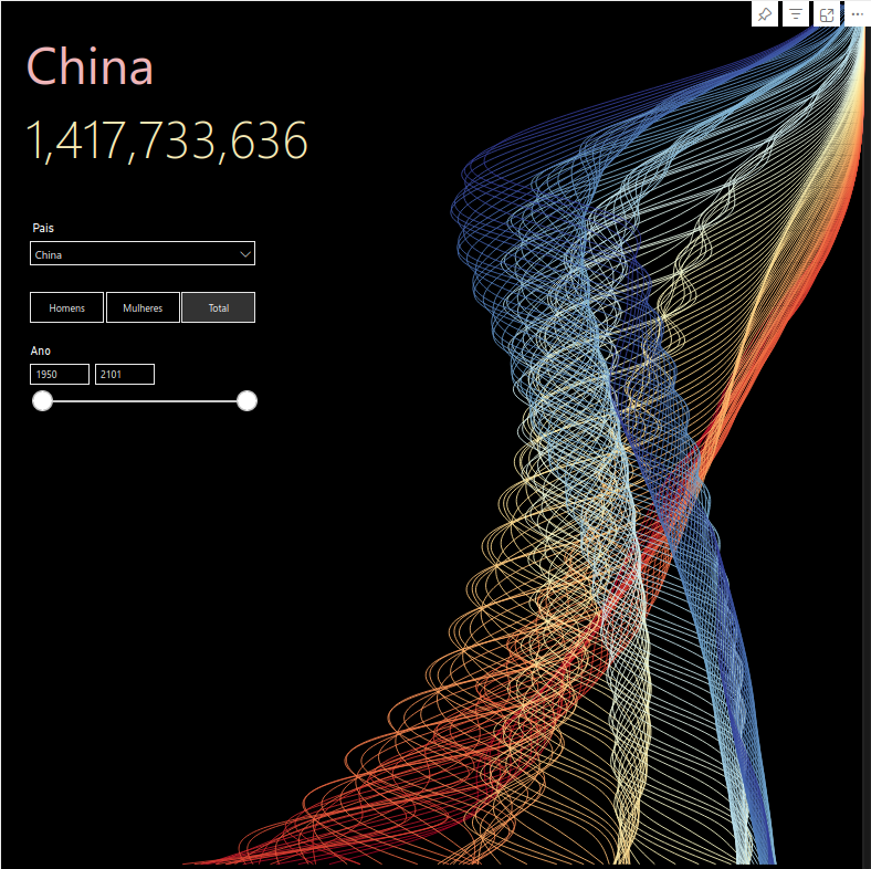
Trying a Power BI version
Power BI combines advanced data management with a mediocre data visualisation engine, and it is frustrating to navigate its very basic—and often incorrect—implementation.
These population pyramids are not particularly complex and are easy to recreate in most software. In Power BI, however, there is no reasonable way to do this, because it does not support line connections between points in a scatter plot.
The alternative is to use Deneb, which allows a programming language (Vega) to be interpreted and linked to data managed by Power BI. In the image below, the chart was created in Deneb and everything else (text, slicers) consists of native Power BI visuals. The best of both worlds, really.
(As I mention on the FAQ section of the home page, most of the charts I publish are built in Vega for exactly this reason: the ability to later reuse them in Deneb within Power BI.)