
Introduction
The RASI (the Portuguese Annual Internal Security Report) is hard to describe to anyone working in visual communication. Not because it is a complex object, but because every word that comes out seems too hyperbolic and unfair, because the object simply cannot be that bad. But it is, and from what I gather, it has always been this way (for the last 20 years).
The most recent version, covering 2024 data, is slightly less bad if we look at it with a magnifying glass, but it remains a strange object coming from entities whose job is to manage and analyze information.
I intend to write more than one article about the RASI, focusing on several areas. Today’s topic will be the most obvious one: the bad charts. But there are other problems, which will be the subject of other articles. I promise that the grand finale will be an article in which I humbly propose the changes I deem appropriate.
Charts in the “Infographics” section
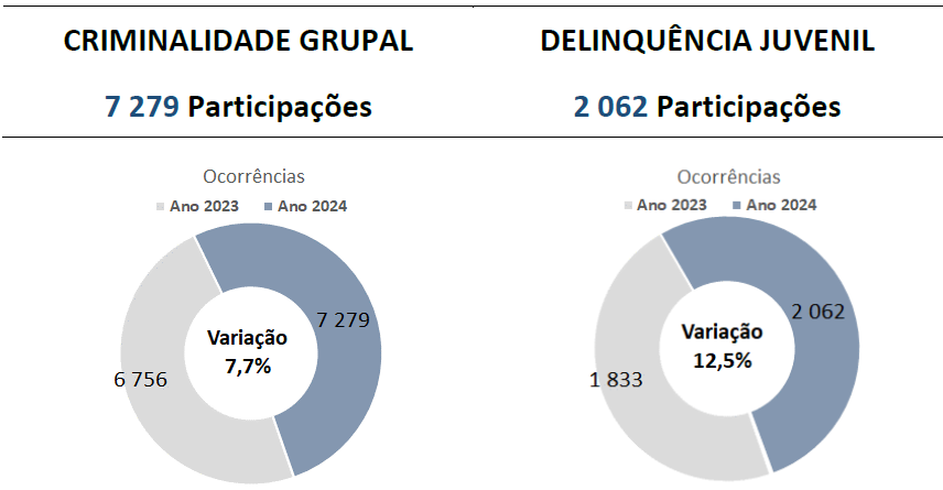
Pie charts express proportions, the weight of each segment in a whole. That whole must make sense. There are many "wholes" that don't make sense, but using years as segments is perhaps one of the most egregious ones. No one conducts an analysis to determine that 52% of group crime occurred in 2024, versus 48% in 2023.
Likewise, a stacked bar chart is not made to conclude that hashish seizures decreased by 80.6% between 2023 and 2024.
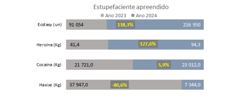
Note that, in both examples, it is impossible to visualize the variation, so it has to be communicated via a number in a label.
This is the infographics section, which spans several pages with the same visualization philosophy.
Characterization: Internal Security
In the context of the RASI, this chart is one of the best. However, I would prefer if the vertical scale explicitly shown; it doesn't start at zero (which isn't problematic in a line chart), but it would be more comfortable to know where it begins. Of course, the word "Year" on the horizontal axis is totally unnecessary.
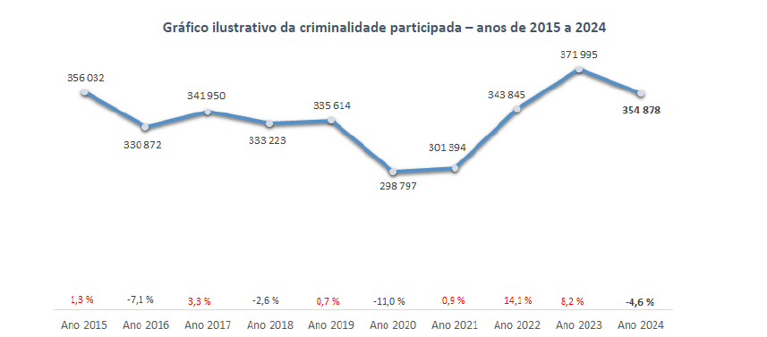
But it contains something that has been one of my pet peeves in reading the RASI for many years: the expression "Illustrative Chart". A chart "illustrated" some numbers in the last century, when data comprehension was derived from data tables and charts were used only to break monotony. Charts were not relevant at all, beyond that. Today, the visuals communicate a large part of the message; they are not appendices, they do not merely illustrate. This little expression alone would suffice to demonstrate that the authors, regarding data visualization, are still living in the 20th century. It is this idea of the chart as an illustration that gives rise to the bad charts we saw above and the even worse ones we will see next.
A common problem in reports with multiple authors is the inconsistency of styles and, in particular, the color palette used. Here we begin to observe just that.
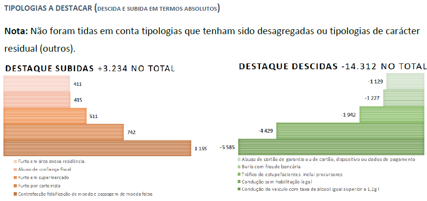
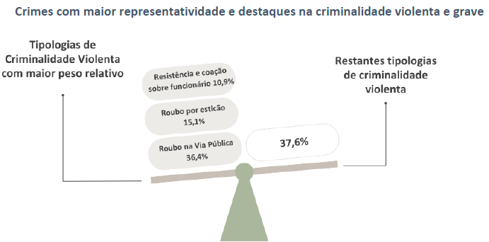
This should, naturally, be a single chart. The bars should be ordered by magnitude, from largest to smallest” And each bar should have its own label, not a legend that forces the back and forth movement between the bars and the legend.
This thing (I don't know what to call it) is one of the authors' favorite representations, this year with a more minimalist design. The total adds up to 100%, so I imagine it is a proportions chart, but I don't actually see them represented.
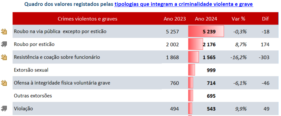
In Excel 2007, Microsoft introduced a very useful type of conditional formatting where it was possible to associate bars with values in cells. In true Microsoft fashion — always choosing marketing over chart effectiveness — the bars had a gradient to white, which made them difficult to read, but they were flashy. In a later version, they added bars without gradients, and the option to include a border on the gradient ones. These are the ones used in this table.
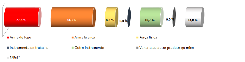
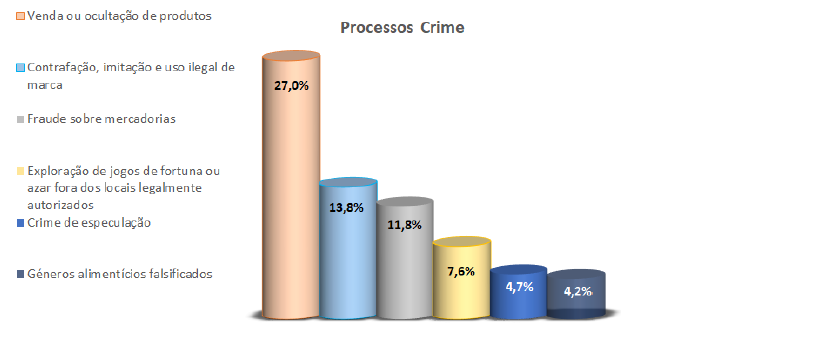
You saw this coming, didn't you? Yes, the 3D effects. This is also one of the charts that has endured the test of time. (It has no title, so it wasn't included in the image, but it corresponds to the type of weapon used in homicides.) As you can see, the authors did not hold back, and used their entire arsenal of graphic misdeeds at their disposal: a 3D "exploded" circular bar, alphabetical ordering of categories, inconsistent colors, and an unnecessary legend.
On the same page, there are other examples (it is, in fact, one of the report's most glorious pages).
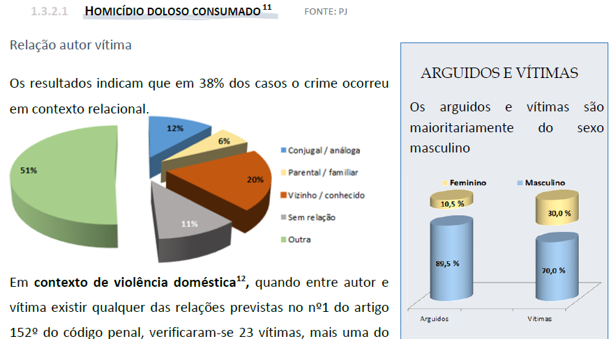
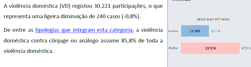
In the section on domestic violence, pink is used for women, contrary to the chart above. I don't think that is a good idea.
Finally, a gallery (non-exhaustive) of 3D bar charts with multiple color styles that express the report's graphical inconsistency.
Conclusion
Years ago, in a training course, I showed a bad chart published in a State Budget report. Someone commented something along the lines "if they don't even know how to make charts, how can they know how to govern?". It doesn't seem to me that knowing how to make charts needs to be a universal skill, nor an indicator of a lack of competence in other domains. The criticisms of this report are limited to my own competencies.
However, this is not an ordinary report. A report on state security should, at a minimum, possess a visual sobriety compatible with what is being reported, without resorting to these canned decorative effects that diminish it.
Being the worst of the known examples, the RASI is not alone. The culture of the "illustrative chart" that illustrates — God knows what — and fails to communicate, is frequent in many State bodies, including, for example, the Portuguese Parliament. But there is a general insensitivity to the need for graphic literacy (and numerical literacy, in general) that is worrying, and is moving away from the trends in the majority of European countries.
