
What is the most appropriate chart to represent x?'
In my first meeting with students from my training courses, this is the age-old question. It’s completely understandable.
However, if we aspire to a modern perspective on data visualization, the first thing to do is rephrase this question. It should be something closer to:
'What question am I actually asking the data, and how do I design the chart to answer it in the most [____] way?'
The blank space is filled according to our intention: 'effective', 'efficient', or 'artistic / aesthetically appealing', for example.
In other words, it is not just about choosing the chart type, but also about how we align it, through design, with the questions we ask.
To illustrate this, let’s look at this Sankey diagram published in this report:
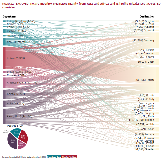
I rarely make Sankey diagrams, so I don’t have a mental recipe of my own for making them. However, I know its easy for them to fall into the dreaded spaghetti effect, where it becomes difficult to draw any relevant conclusions. Unfortunately, I believe that is the case here. Aside from the Africa-France flow, everything else requires a fair amount of effort to be read and interpreted.
The title of the Sankey chart highlights two main conclusions: the primary origins are Africa and Asia, and the destinations within Europe are highly unbalanced. Therefore, the challenge was to create a chart that also highlighted those conclusions, but more effectively. The first version I created, using the exact same level of detail, was this one (the data is essentially the same, though the country groupings differ slightly without compromising comparability):
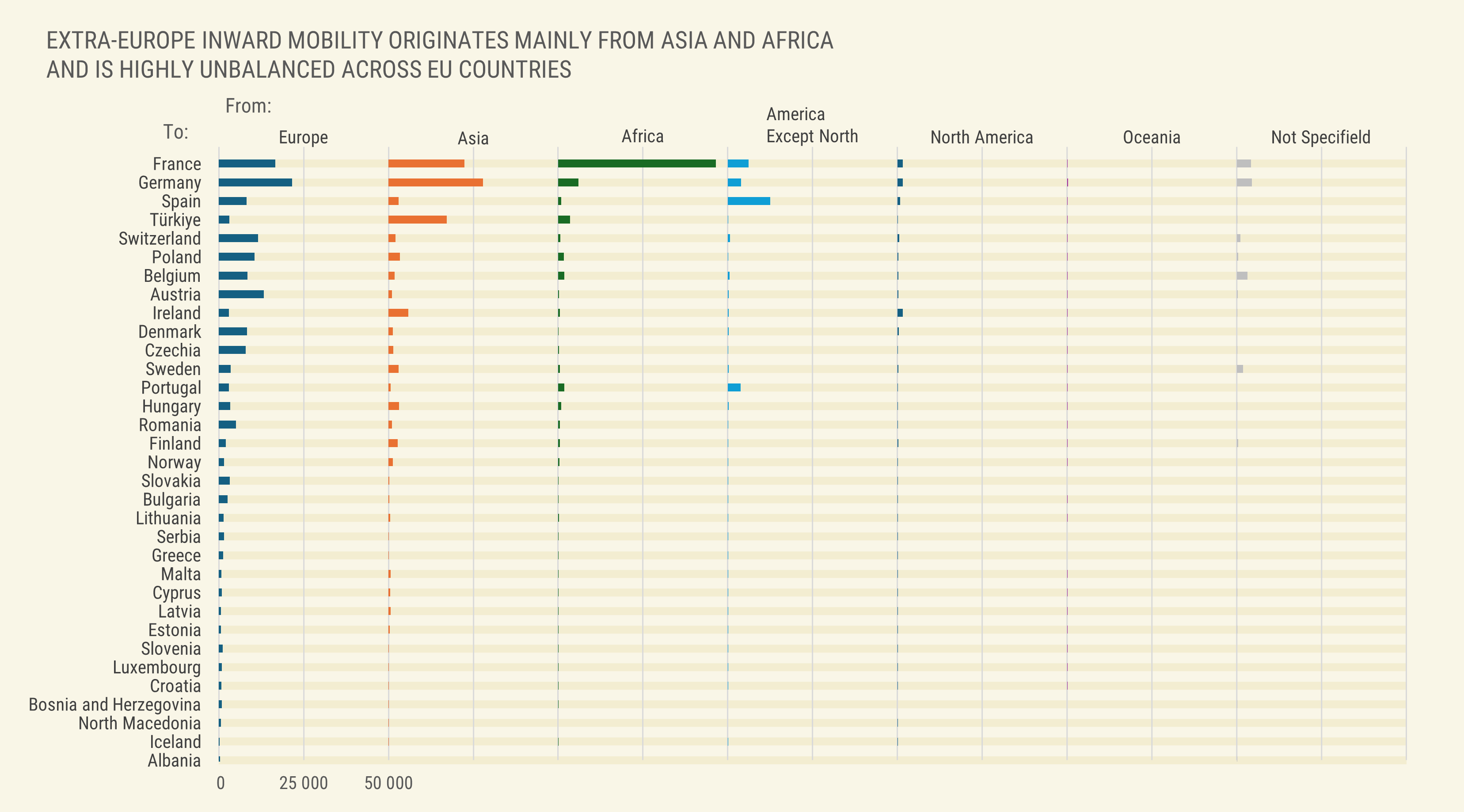
This chart contains all the detail of the previous one, yet it allows us to easily notice things that were almost invisible, such as the fact that mobility to Portugal originates mostly from the Americas excluding the North (in our case, Brazil). The residual values in most bars reflect the imbalance in destinations to which the original chart's title referred.
But I love designing circular charts with many slices, because that is a cardinal sin in data visualization. So, I created an alternative to the alternative:
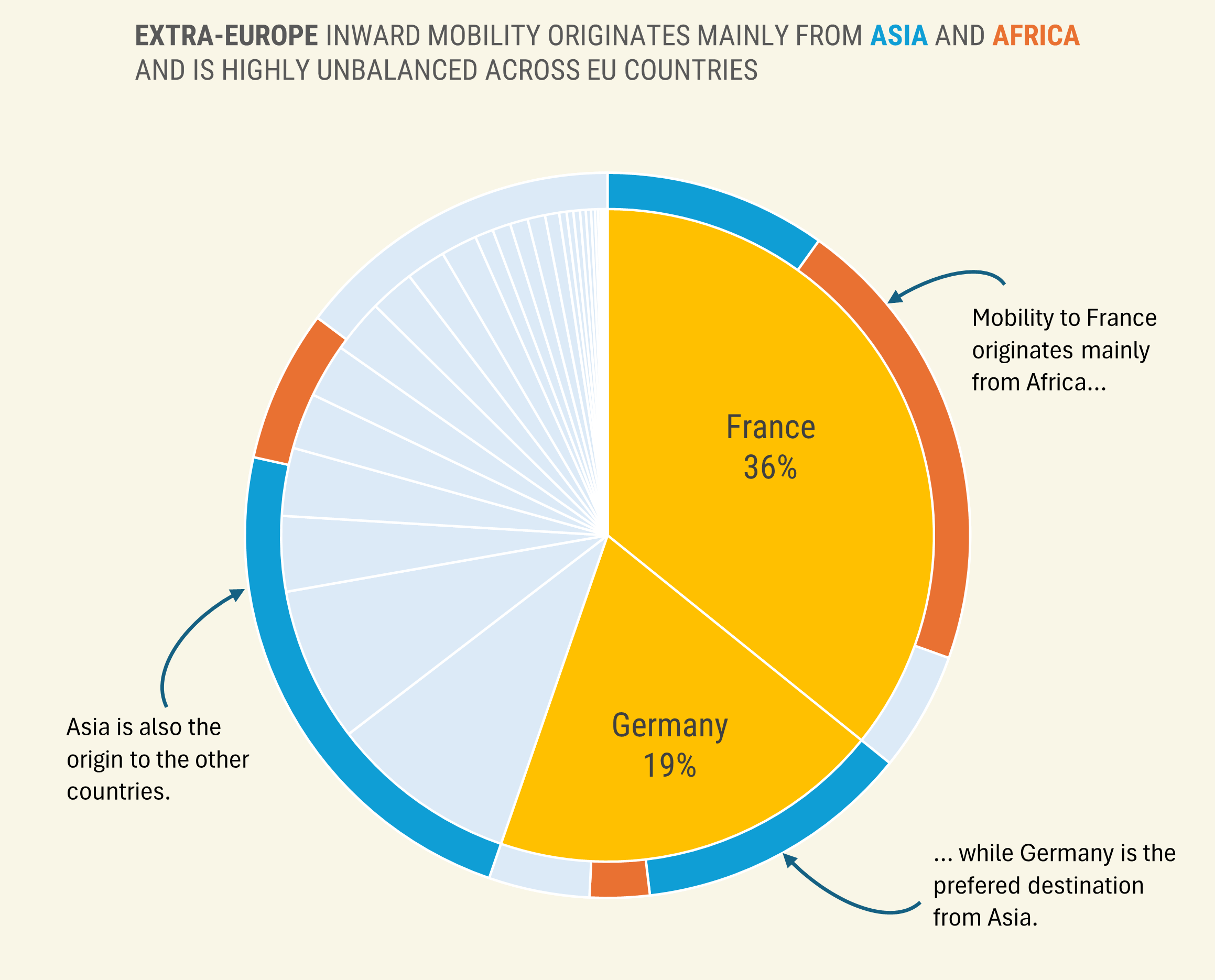
It seems to work: we immediately see that France and Germany are the main destinations, but with different origins. The rest is highly fragmented (one of the insights noted in the original title), but now we can see that it roughly follows Germany’s profile.
The Sankey is more eye-catching but, in my opinion, this humble pie chart communicates relevant insights more effectively. This perfectly illustrates the point made above regarding chart choices: between a sophisticated chart that is misaligned with the message, and a simple chart that clarifies it, the latter is always the most appropriate.
