
The RASI (Annual Internal Security Report) is my pet peeve. On the left side of the image, I’m showing a page that exemplifies the type of visual representation favored by the report. It discusses intentional homicides and displays the charts you see there. It has the particular quirk of not telling us how many homicides actually occurred (we have to go looking for it), which is a minor additional irritation.
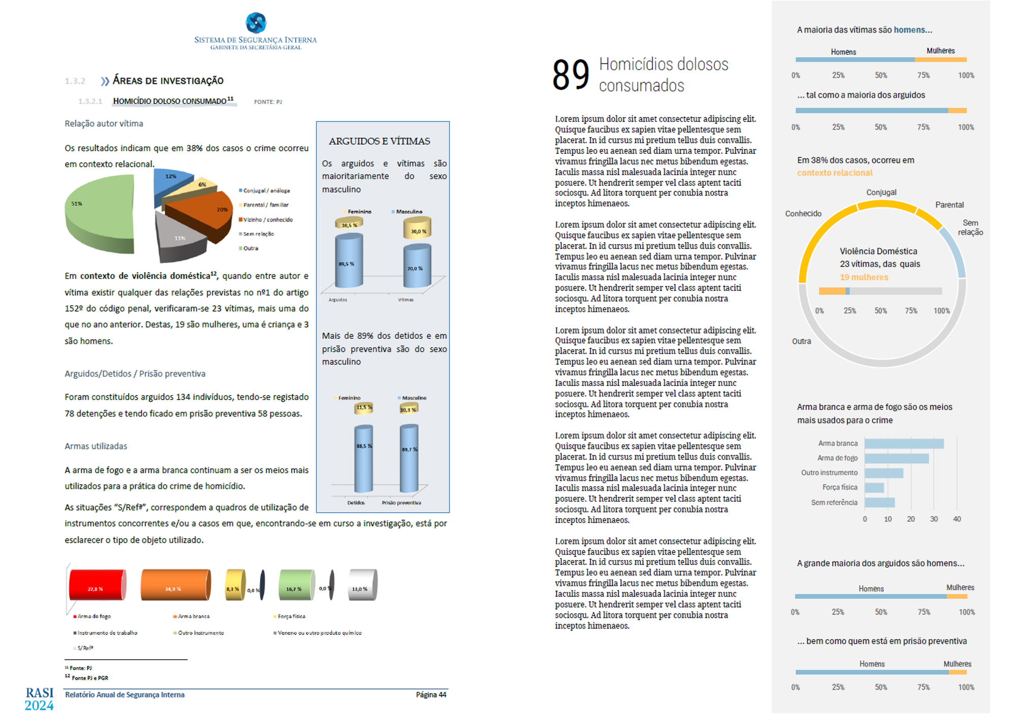
I decided to take a break and spend an hour remaking the charts (right side of the image). The entire page is a quick draft in Excel (also to show that in-house work doesn't have to be... like that).
There are a few key themes that may or may not be fully realized in this version, but that I consider important:
- A reference point (the 89 homicides, though it is poorly designed);
- Clarifying the message of each chart;
- Creating a sequence/narrative;
- Reducing the chart size to free up space for analytical text nearby.
Often, the challenge in data visualization is less about creating a suitable chart and more about building visual narratives with multiple objects that don't always like to sit together. I highly recommend this type of exercise. And, considering the reports published in Portugal, there is plenty to choose from.
