
The chart above contains 438 series. This means it has about 430 more series than the maximum recommended value for a line chart. Moreover, being an Excel chart, it has almost double what Excel typically allows. What I want to demonstrate with it is that advice and limits should not always be taken literally; we can think beyond the 'rulebook'.
Context in Data Visualization
The advice to limit the number of series in a line chart is based on how easily it generates the 'spaghetti effect': a tangle of lines where it is difficult to observe any pattern or trend.
However, this only happens because we don't actually know what we want to communicate with the chart. The same chart, with the same lines, can be excellent if we know how to set priorities and express them through the chart's design. Think of a story: who are the main characters? Who are the supporting ones? Who are the extras? Each should have a design suited to their relevance.
Here, we have two series showing the evolution of accumulated heat (we’ve seen this concept here) over two years. All the other lines serve as context, helping to understand and interpret the main series.

Context series serve only that purpose: to allow us to see where the main series are positioned (by observing the range and density of the values). Generally, context series don't even need to be identified, although in an interactive setting, we could hover over them to see their labels.
Number of Series in Excel
The maximum number of series in an Excel line chart is 255. This has always annoyed me a bit when I wanted to create charts with context lines that easily exceeded that number. But there are other cases. For example, these population pyramids cover 150 years (150 series), if we split them by sex, we get 300 series.
The chart above is a scatter plot with four series: the two identifiable ones that could be in a legend, and all the others, which are actually just two series—one for each year. The trick is to create a table like the following, with a blank row between categories:
| Category | Day | Value |
|---|---|---|
| A | 1 | 10 |
| A | 2 | 12 |
| A | 3 | 11 |
| B | 1 | 8 |
| B | 2 | 9 |
| B | 3 | 7 |
| C | 1 | 15 |
| C | 2 | 14 |
| C | 3 | 16 |
In this example, Excel will create three segments, always using the vertical axis for values and the horizontal axis for the timeline (or vice versa depending on your setup).
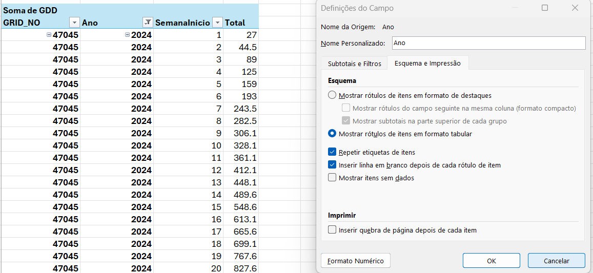
The issue here is the need to insert blank rows into a data table, something I dislike doing. But there is an excellent solution: instead of using the raw data table as the data source, use a Pivot Table.
The Pivot Table should be formatted as shown in the image. In the field options, enable both 'Repeat item labels' and 'Insert blank line after each item label'. Then, simply select the entire column, and the lines will be rendered as if they were independent series.
An alternative using the new dynamic arrays is to use VSTACK() to create a stack of categories with a separator row.
Conclusion
In most cases, line charts benefit from the addition of context series. Excel does not make it easy to create charts with dozens or hundreds of series, but the technique presented here can be used to treat them as a single series, without the need to manually change the characteristics of each one.
Subscribe to the Academia Wisevis for a data visualization course and more content applying these ideas to your favourite tools!
