
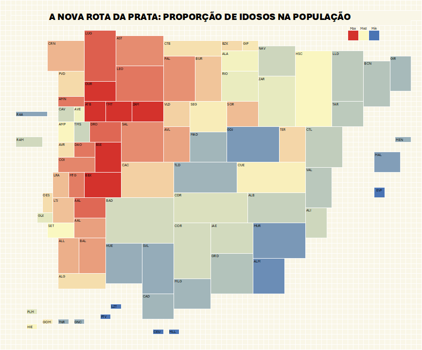
As a Portuguese person who is largely unaware of much regarding Spain (though the reverse is even more true), until recently I had never heard of the Silver Route, an ancient trade route running parallel to the Portuguese border (take a look at the image in the bottom right corner and search on Wikipedia if you are interested).
I created this tile map of the Iberian Peninsula’s NUTS3 regions and was experimenting with the visualization when I noticed this: a "silver route," not in a commercial sense, but related to hair color. This line, which stretches from Alentejo up into Galicia, corresponds to the area of the peninsula with the oldest population (percentage of seniors aged 65+ in the total population).
About the technique
I used merged cells in Excel to create rectangular regions that approximate geographical configurations and applied conditional formatting to color the visualization. Each region points to a column of values, allowing me to populate that column with any data I choose. Each region is identified by a three-letter code.
This is useful because Excel has a difficult relationship with maps, and we don't always need full geographical detail. This solution is often sufficient to represent spatial patterns.
